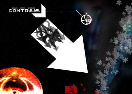
Continue.
Created on: August 17th, 2006

I used the preloader because I want the full effect to take place, and because it should allow you to scroll down to see the entire picture
Sponsorships:
| user | amount | user | amount |
|---|---|---|---|
| No one has sponsored this site ( ._.) | |||
| Sponsor this site! | Total: $0.00 | Active: $0.00 | |
Vote metrics:
| rating | total votes | favorites | comments |
|---|---|---|---|
| (4) | 6 | 0 | 7 |
View metrics:
| today | yesterday | this week | this month | all time |
|---|---|---|---|---|
| 0 | 3 | 2 | 2 | 2,232 |
Inbound links:
| views | url |
|---|---|
| 49 | https://www.bing.com |
| 6 | http://www.google.com.hk |
| 2 | http://216.18.188.175:80 |
| 1 | http://ytmnsfw.com/keywords/16/1 |
| 1 | http://www.google.com |
I really like this, most other people won't though. Once I crop this the way I want it so it's wide screen, it shall grace my psp as an interesting wallpaper. I love how forms are concentrated into the top left corner, where more people start reading things so it's natual to go the that spot first, yet the way objects are placed brings you into the rest of the image. I also like how you didn't place anything directly in the middle, that spot is already important enough. Are you any type designer by chance?
Bold
Italic
Underline
Code
User Link
Site Link